Capri Sun Cherry Coded
A social-first campaign built around one idea: everything, everywhere, all cherry.
The Brief
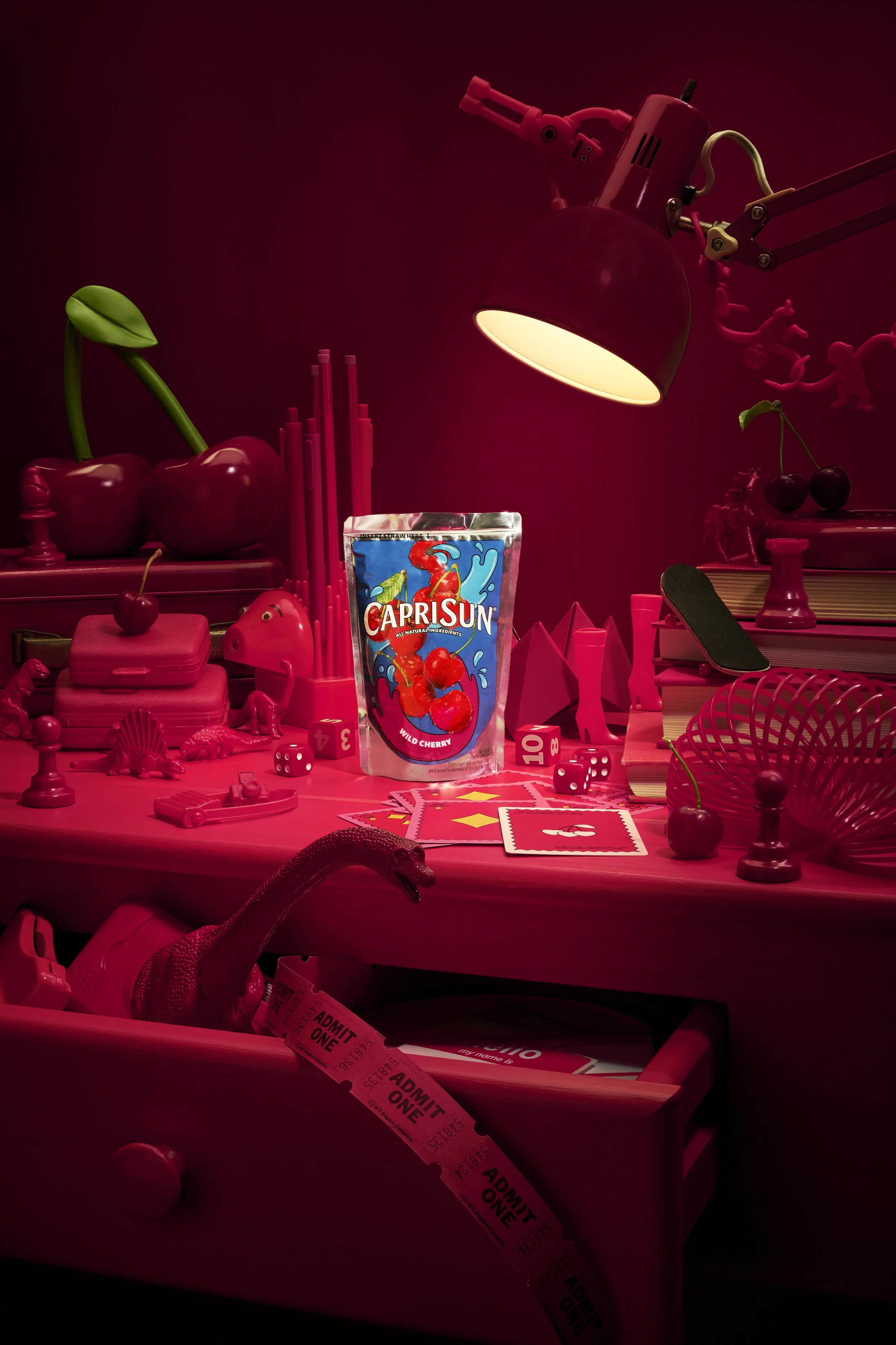
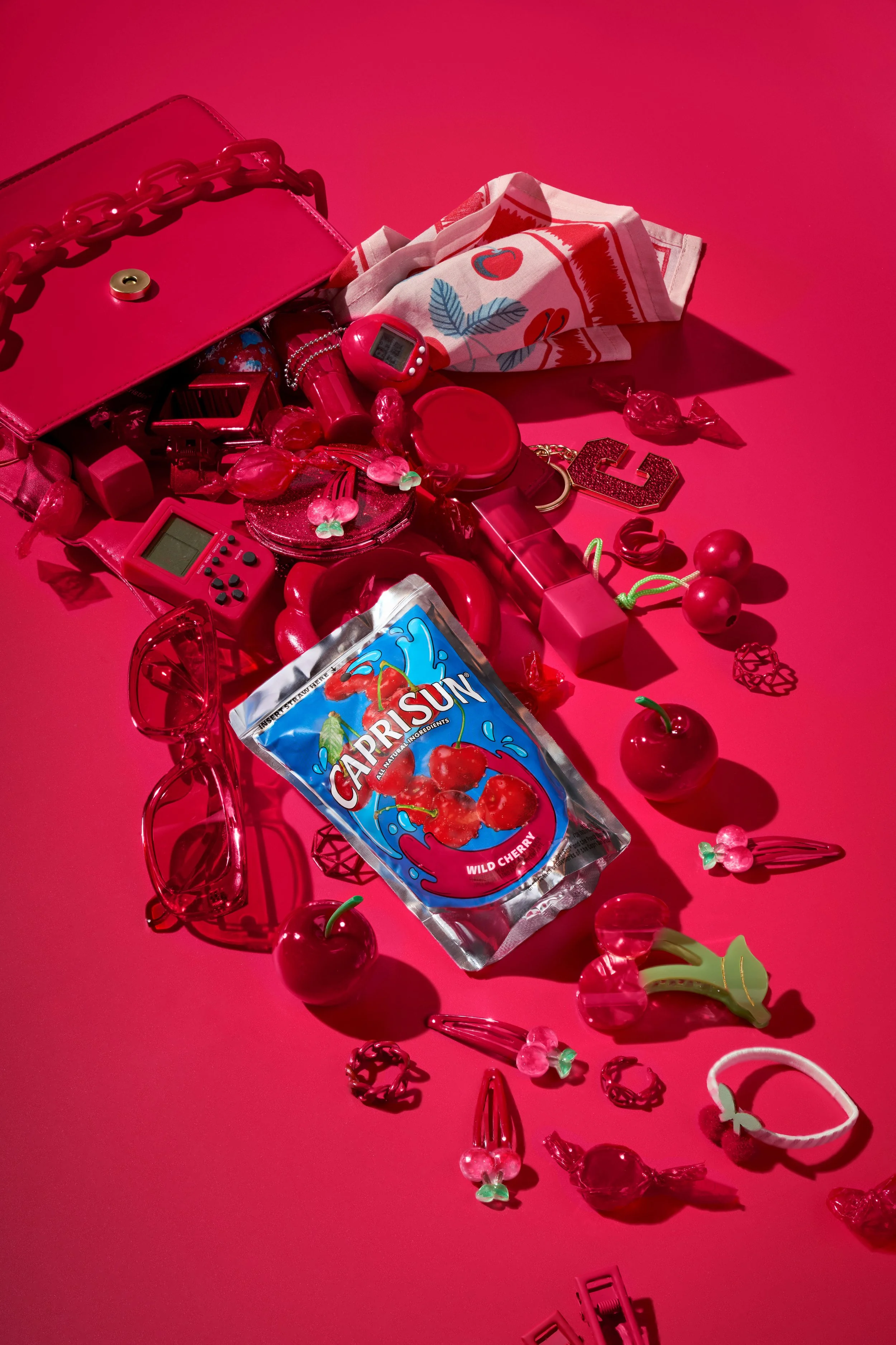
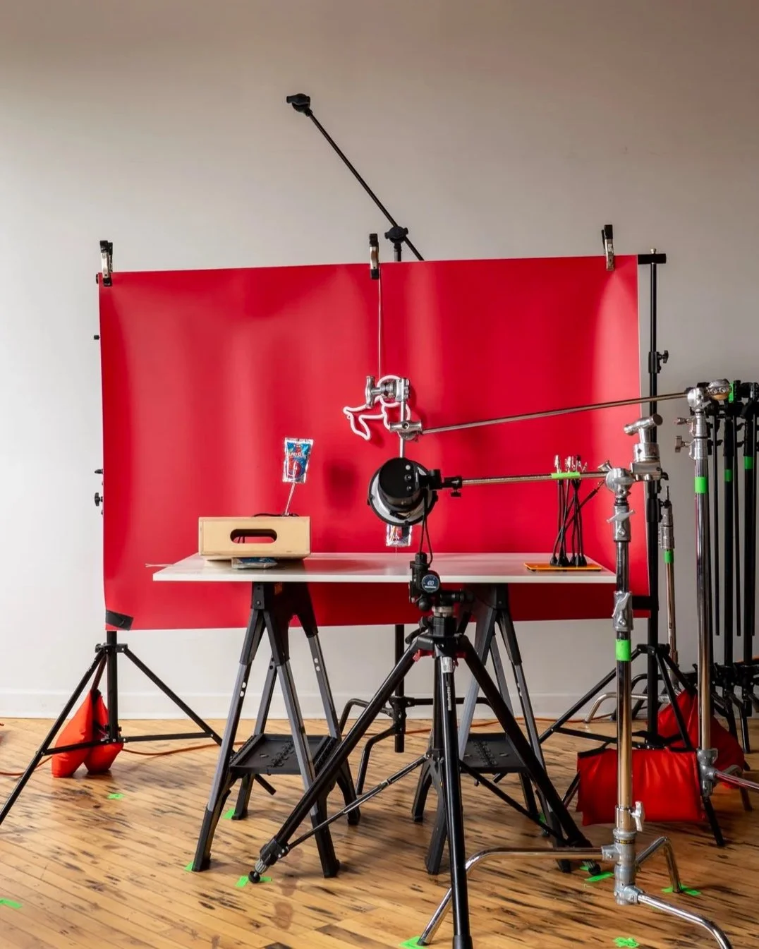
“Cherry Coded” leaned all the way in, color, concept, and composition. We built a fully saturated cherry red world where the Capri Sun Wild Cherry pouch was the only break in the system.
Each setup played with a different kind of chaos: a packed tabletop, a spilled bag, a floating hero moment. The through line was contrast, structured vs. messy, graphic vs. playful all tied together by that unmistakable cherry red.
The Build
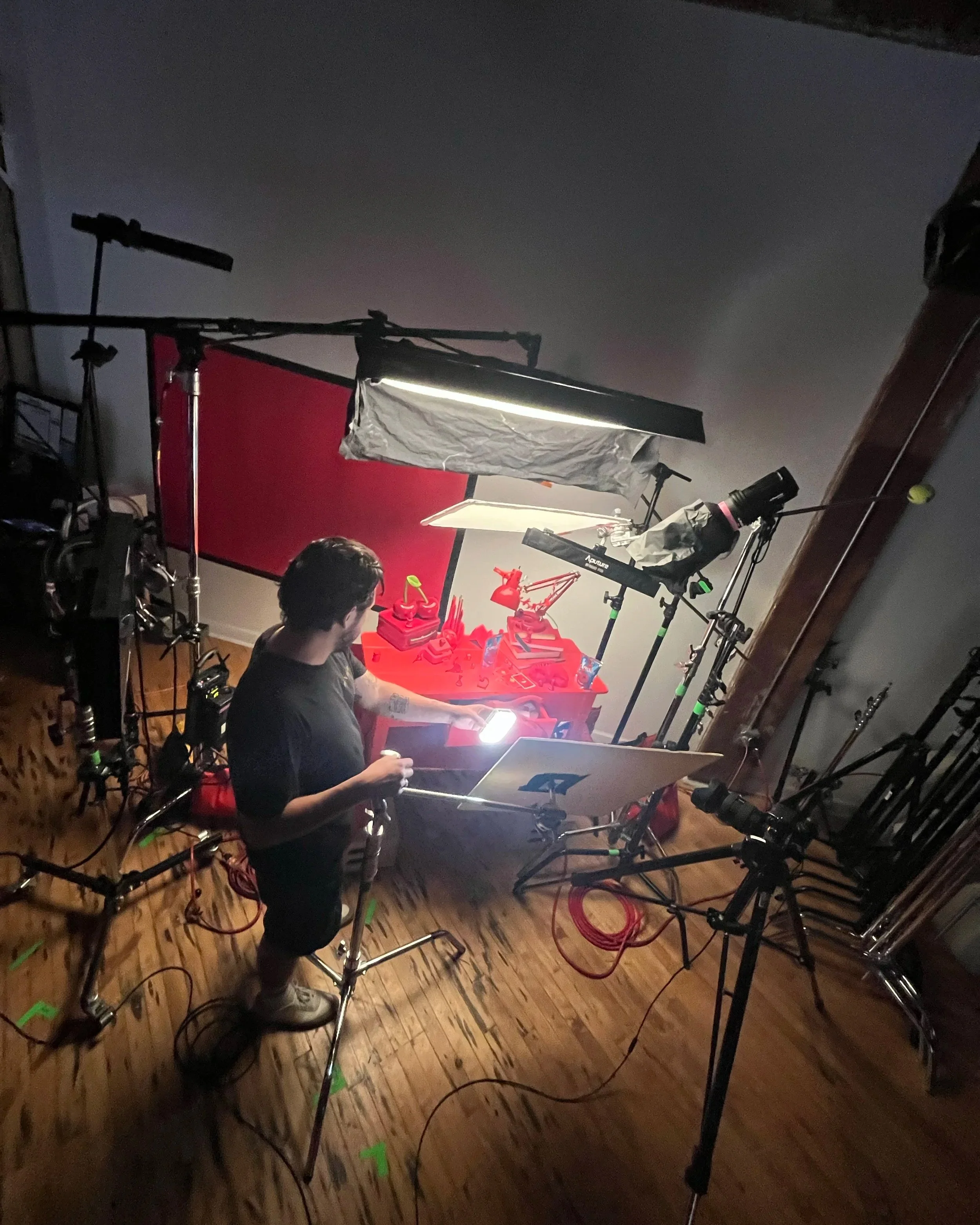
Shot in studio, the campaign was designed for scroll-stopping social moments. Every prop, texture, and highlight was intentional, layered to reward a second look. We started the shoot with the most technical of the three shots, Cherry Coded. This image required extensive retouching to ensure each layer could be assembled in post. There was an issue with a real neon light we purchased for the shoot, there was a plastic back and electrical wiring throughout. It would have been almost impossible to retouch. Luckily we had a LED cherry light on hand from Amazon that gave us what we needed for retouching.
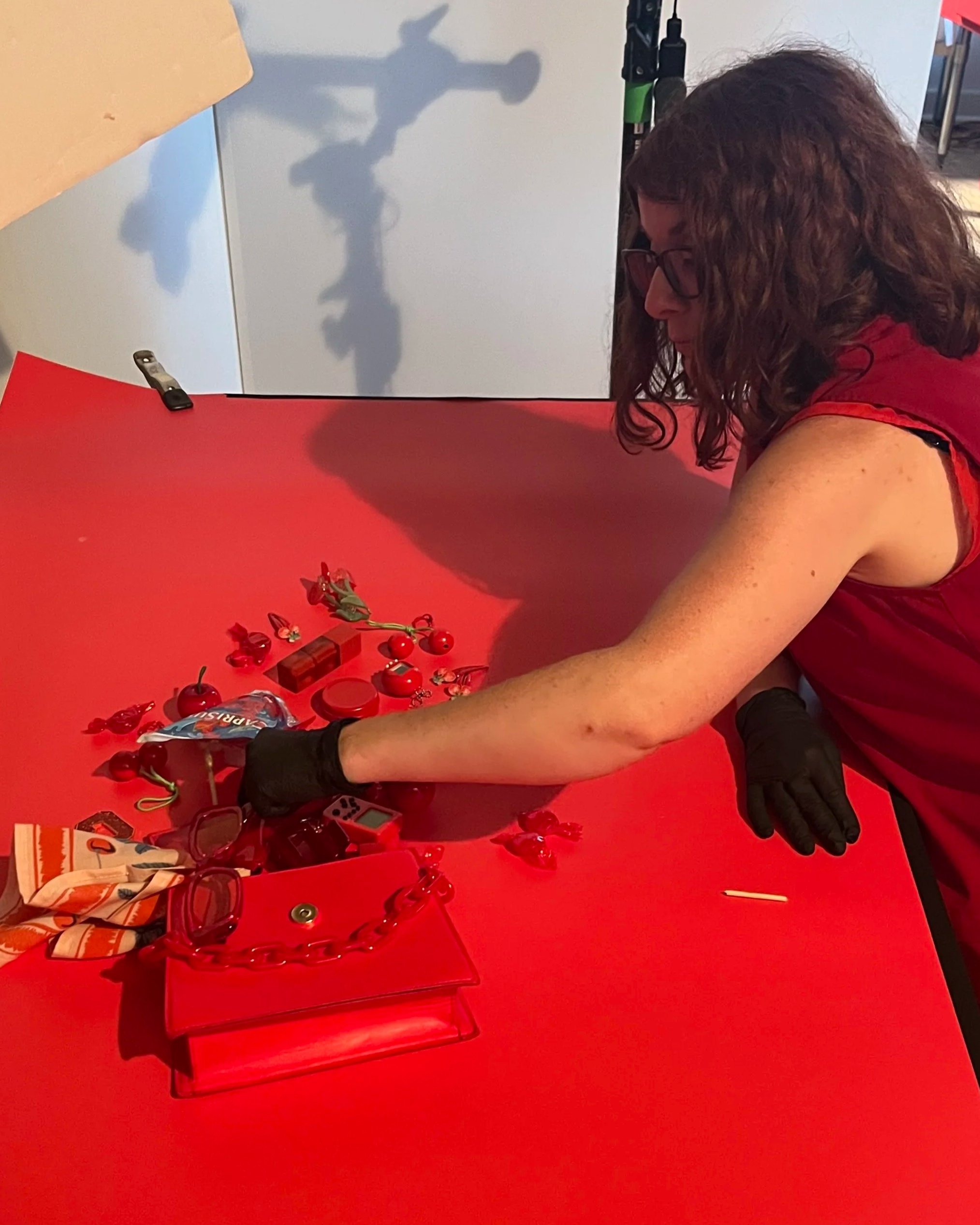
Prop Stylist, Janelle Gonyea spent the majority of her time sourcing all of the 90’s Nostalgia on eBay. She found a Tomagachi, Tech Deck, Barrel of Moneys, Slinky and the iconic View Master. The handheld stereoscopic viewer that became highly popular as a children's toy in the 1990s, often produced by Tyco Toys and later Fisher-Price (Mattel). Janelle being the prop nerd she is, meticulously laid out all of the red things on tables next to set. It felt like we were reliving the 90’s at the coolest all red side walk sale.
Lauren McNalis, of DayMoon Studio, handled the retouching across all three images. There were some fun requests from the team at The Kitchen, Krafts in house agency. We added more outer glow for the Cherry neon, created a bit more atmospheric glow in the nostalgia image. Each image was shot primarily as a red asset and we used a Cherry Pantone to bring out even more Cherry Red color. We left the green of the stems and a bit more color across the final shots, which gave it a bit of life overall. The Kitchen Team loved the results.
I worked alongside a tight team:
Photographer: Ryan Bringas
Creative Director: Glo Diaz, The Kitchen
Prop Stylist: Janelle Gonyea
Lighting Tech: Gadi Solis
Production Coordinator: Camilla Ciedel
The Result
Bold, graphic, and a little surreal, imagery that lives comfortably in the feed but stands out instantly. A campaign that turns a single flavor into a full visual world.